InterTradeIreland
A UX audit and visual refresh to enhance the InterTradeIreland website
InterTradeIreland is a vital driver of business growth across the island, having directly supported more than 60,000 businesses through specialist advice, funding, and cross-border connections. They help SMEs access investment, expand into new markets, and collaborate across borders.
In Phase 1 of this project (2024-2025), I conducted a comprehensive UX audit to identify user pain points, uncover opportunities to create a more intuitive digital experience, and led a site-wide restructure and redesign based on findings. In Phase 2 (2025-2026), I collaborated with a partnering brand agency to update the site’s UI, aligning it with their bold rebrand for InterTradeIreland.
As an existing client of ours, we worked closely with InterTradeIreland to revisit their website and evaluate how it was performing for its users. I led a comprehensive UX audit to assess performance, uncover user pain points, and identify opportunities to strengthen the site.
Using user research such as user questionnaires, persona development, and heatmap analysis, as well as my own knowledge and experience, we identified several key themes:
Navigation clarity: The structure favoured returning users familiar with programme names, but was less intuitive for new visitors.
Consistency and storytelling: Programme pages lacked consistent structure and clarity around who they were for, what they offered, and how to get started.
Content density: Text-heavy sections increased cognitive load and reduced engagement, indicating a need for more digestible, structured content.
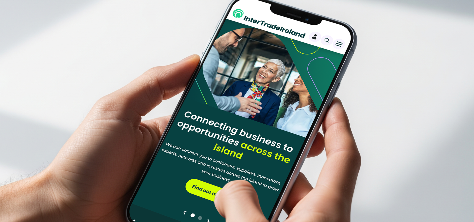
Mobile optimisation: Insights also pointed to opportunities to improve the mobile experience.
My findings were collected into a detailed report, which I later presented to ITI, along with clear, user-centred recommendations to solve the issues we had identified. This project allowed me collaborate closely with many stakeholders, and I gained some valuable experience in balancing the goals of the organisation with the needs of their users.
Based on the audit findings, we introduced the following improvements:
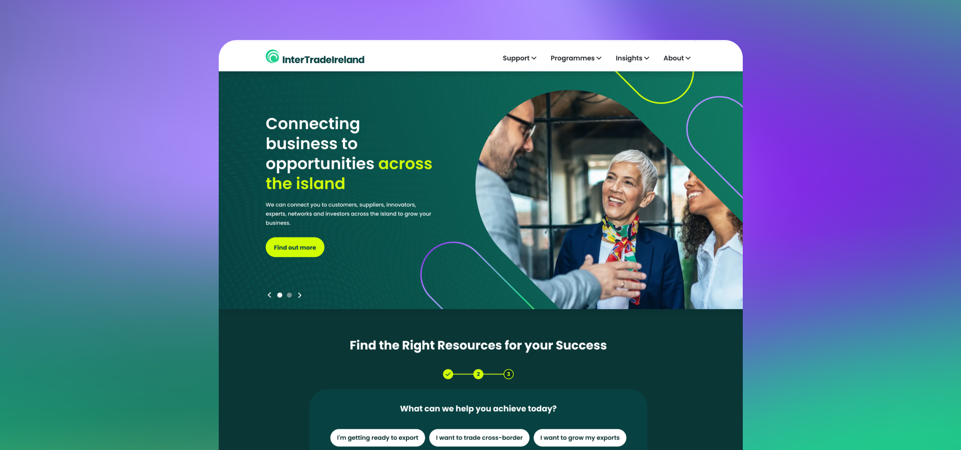
Easier programme discovery: A homepage widget was created to guide users towards the most relevant programmes based on their goals, reduce the legwork for them and shorten their journeys.
Restructured navigation: All programmes were collected under a single, well categorised navigation tab for returning users, while a dedicated “Support” tab was created to better guide newer visitors who needed their goals more clearly defined.
Clearer programme page structures: Programme pages were redesigned with a consistent structure and stronger storytelling. Content blocks amends such as tabbed sections reduced text-heavy areas and improved scannability.
Improved mobile experience: We worked to optimising the site for mobile, and introduced elements like a 'back to top' button to allow a better experience for users, especially on the more content heavy pages.
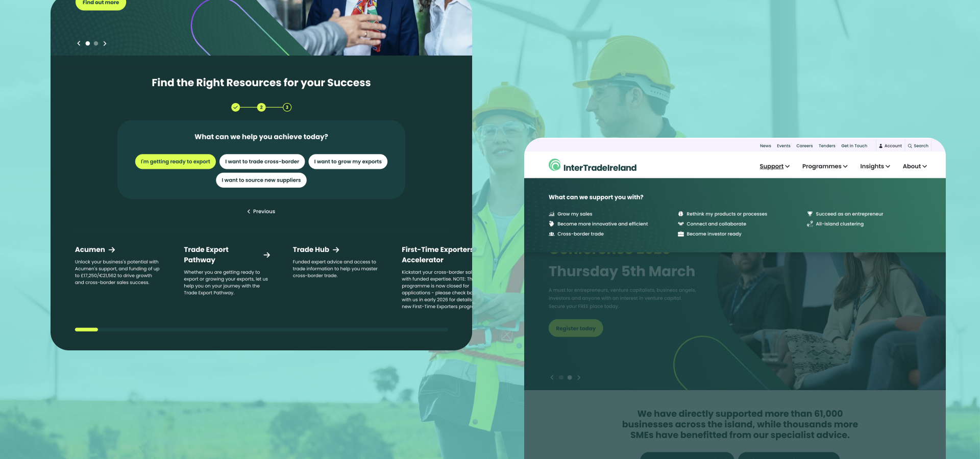
In late 2025, we collaborated with a partnering brand agency to align the website with InterTradeIreland’s bold new branding. This phase focused on reworking the existing design system so that the site could be updated and 'reskinned' within tight timelines, rather than a full rebuild.
I collaborated closely with our development team throughout the redesign process to make sure all the updates were achievable, while also elavated, resulting in a bold and bright new interface that sets InterTradeIreland apart from the crowd.